Pets Deli
The current position I'm holding is part of the product team, where I am in charge of improving the user experience on each page of the website, in order to make the shopping experience as easy as possible for users.
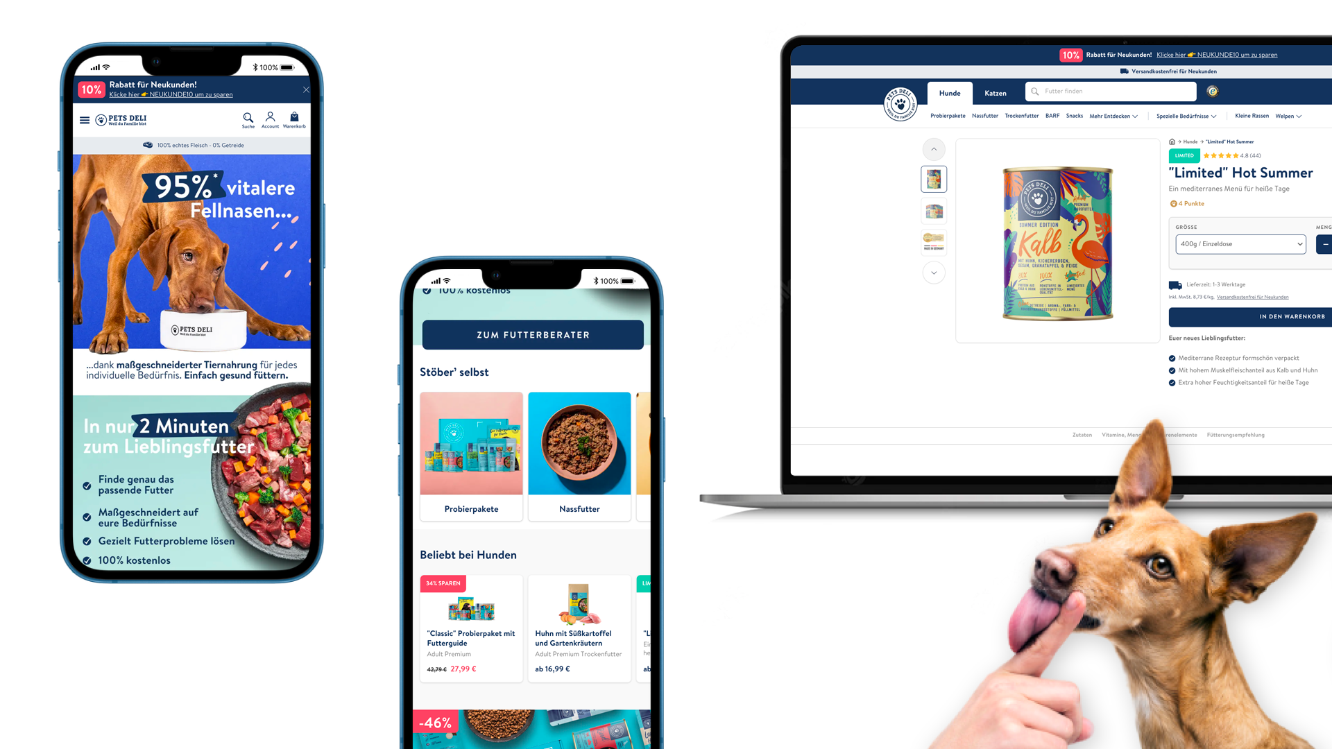
On this project, I worked closely with the project manager in charge of the acquisition; in order to understand why many users were leaving the order process before the order was finalized.
I improved the UI elements of the different steps of the order process :
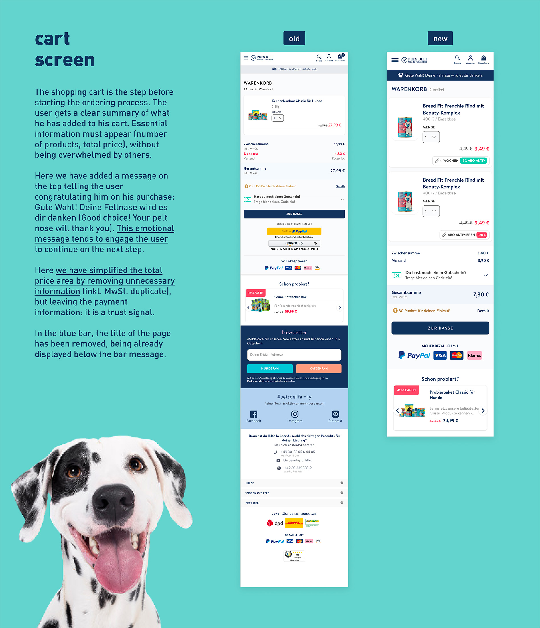
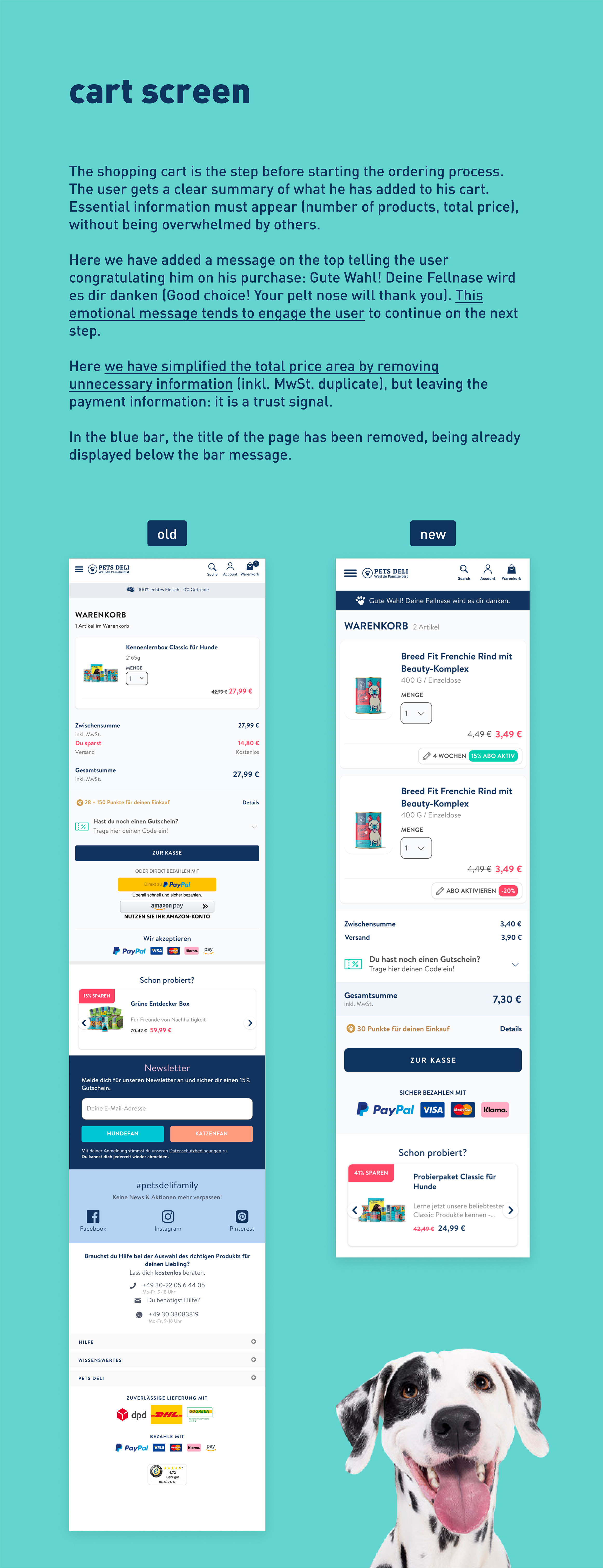
- cart
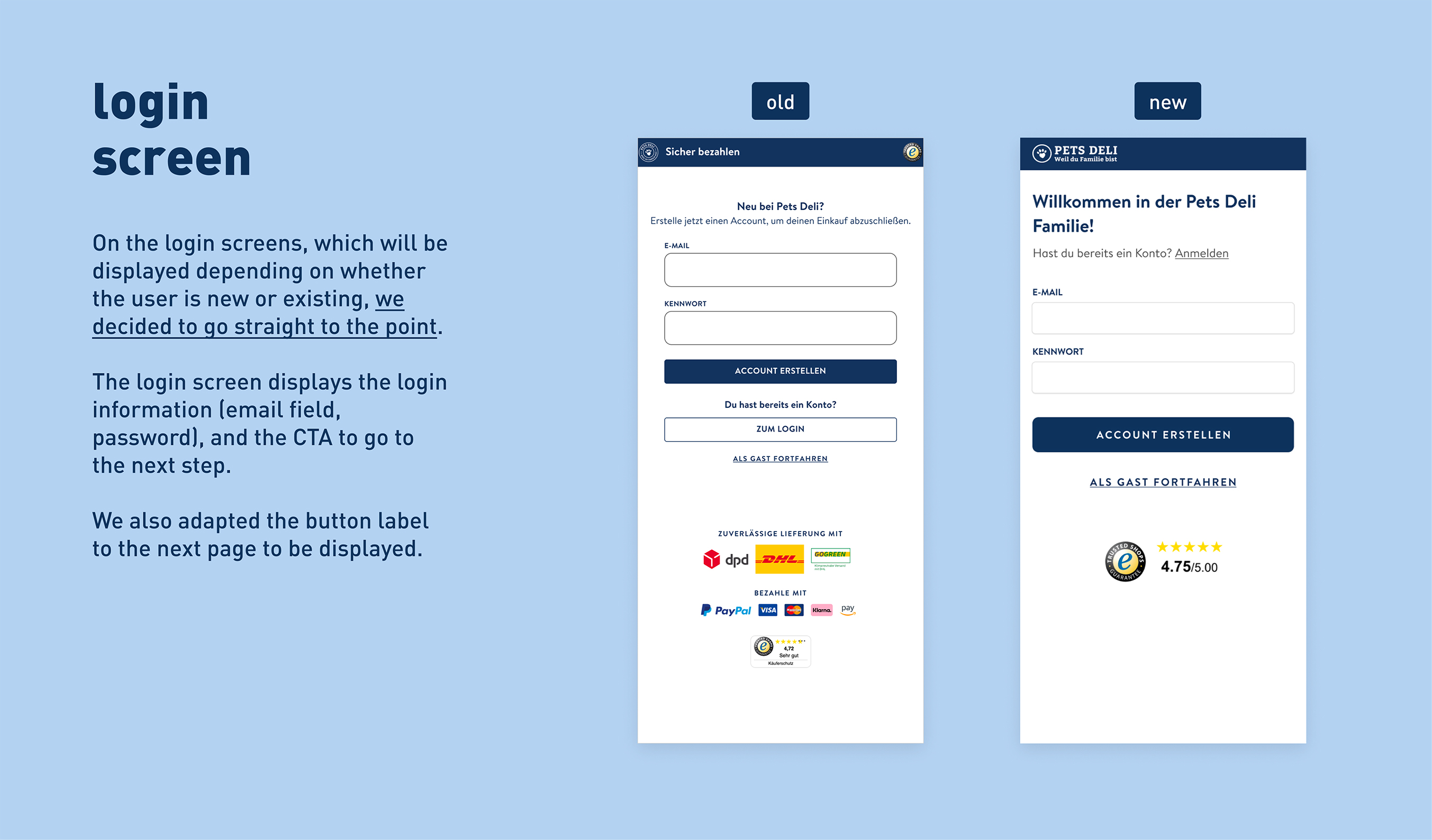
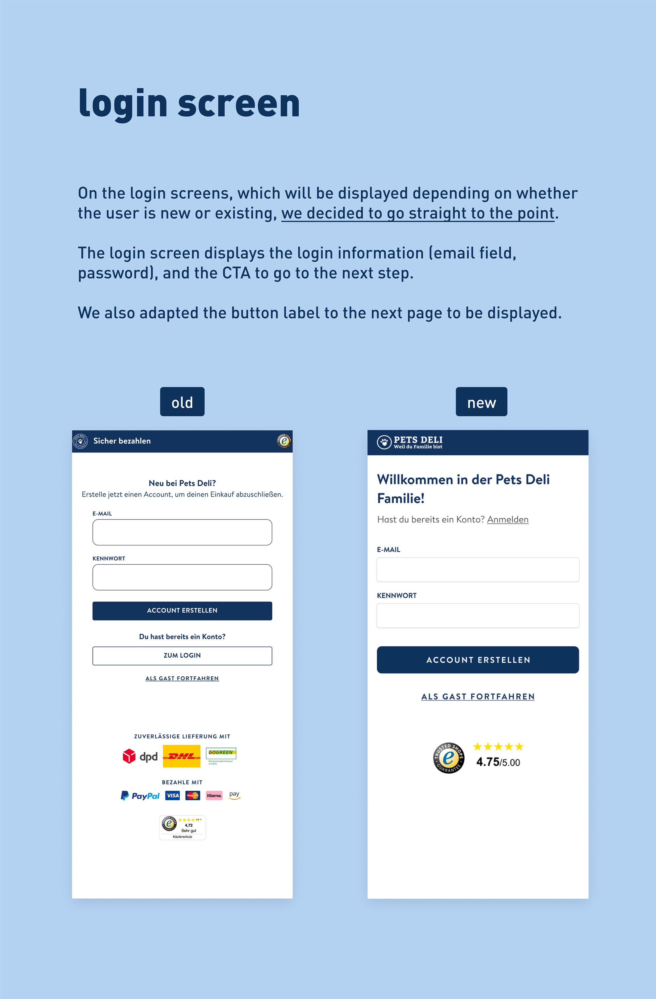
- login
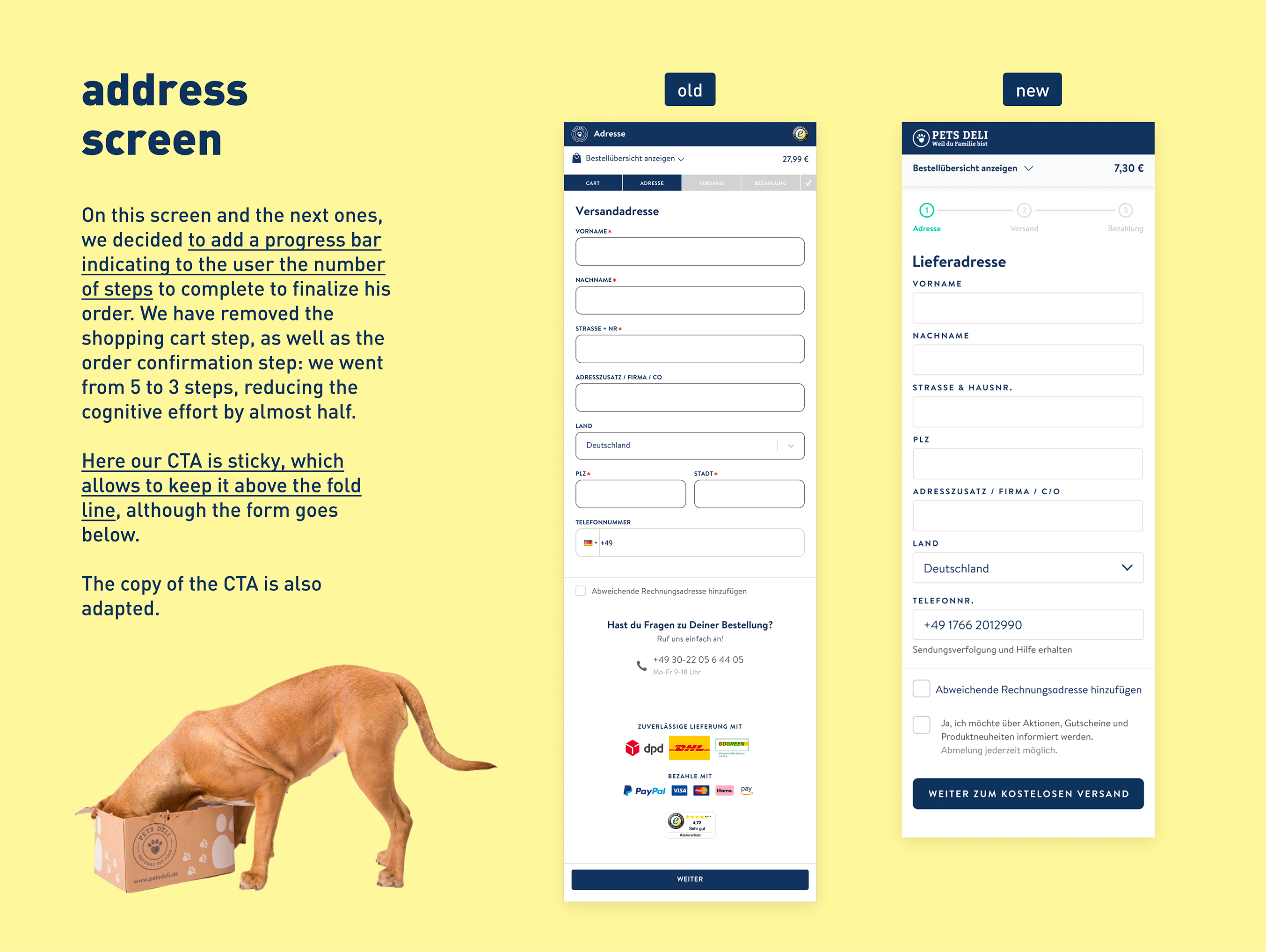
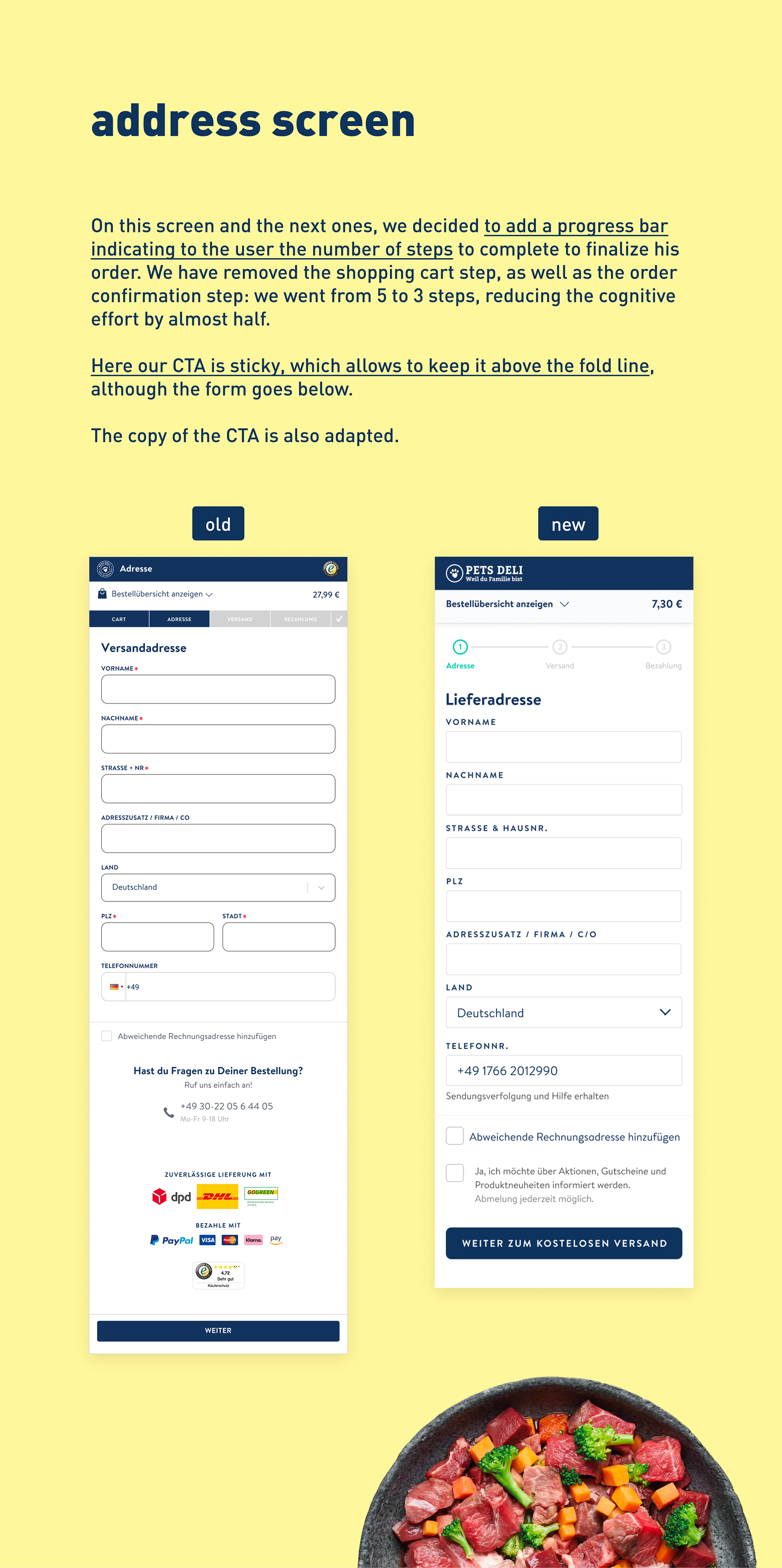
- address
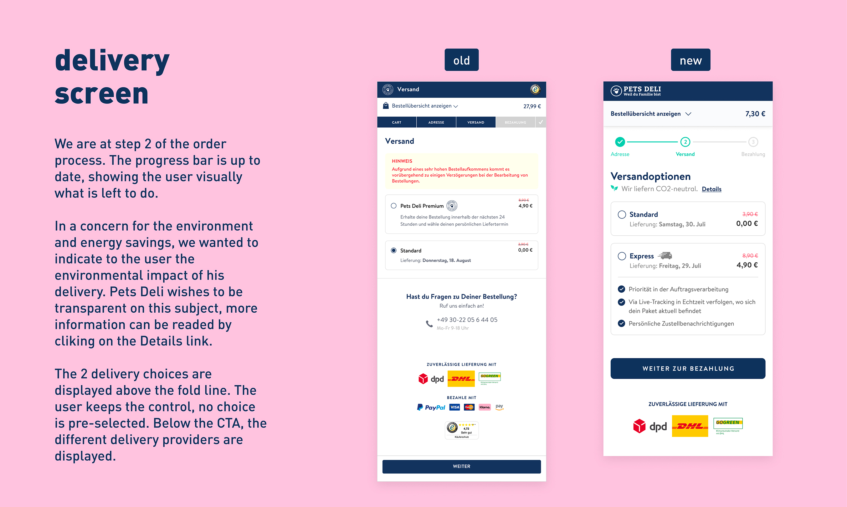
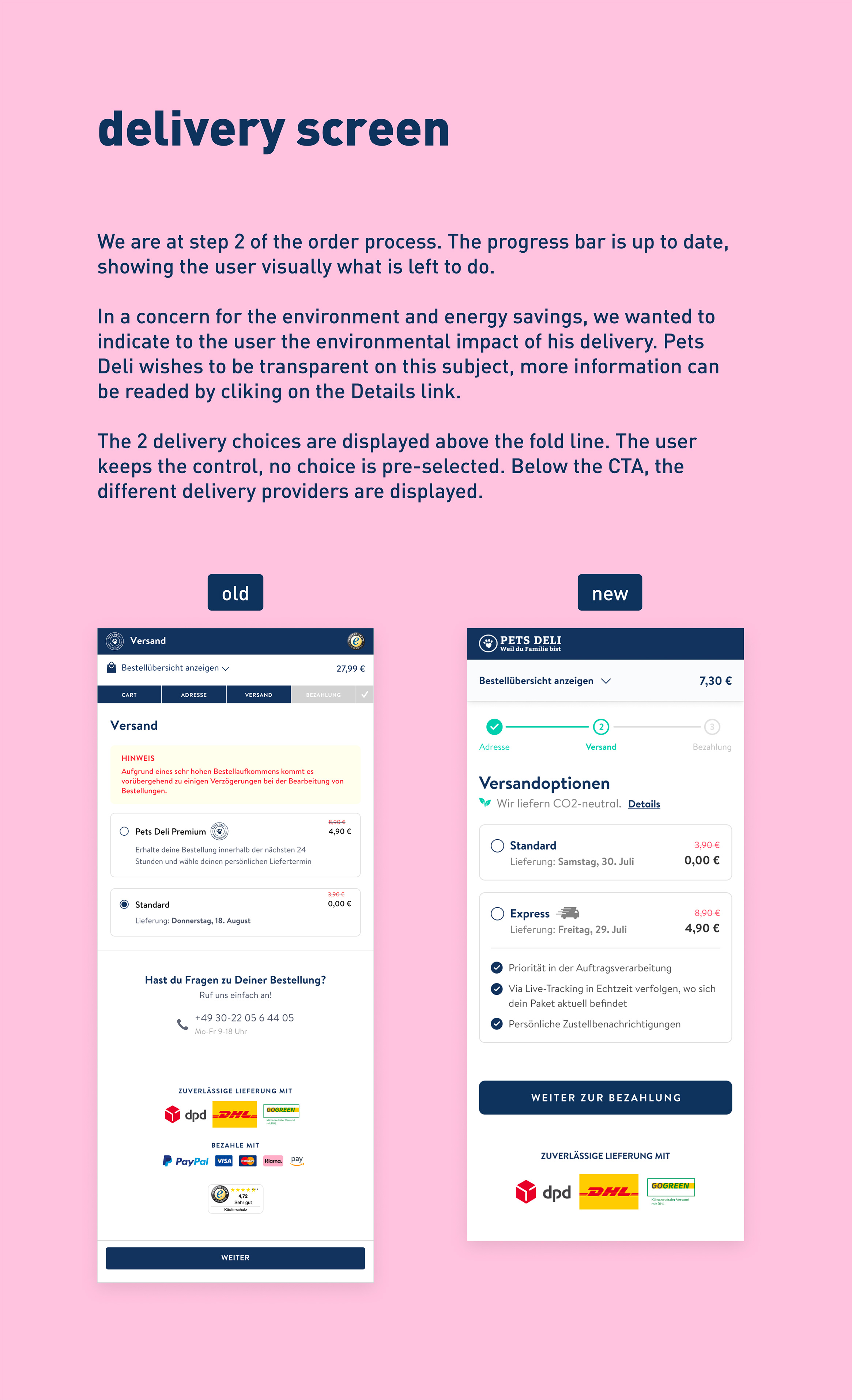
- delivery
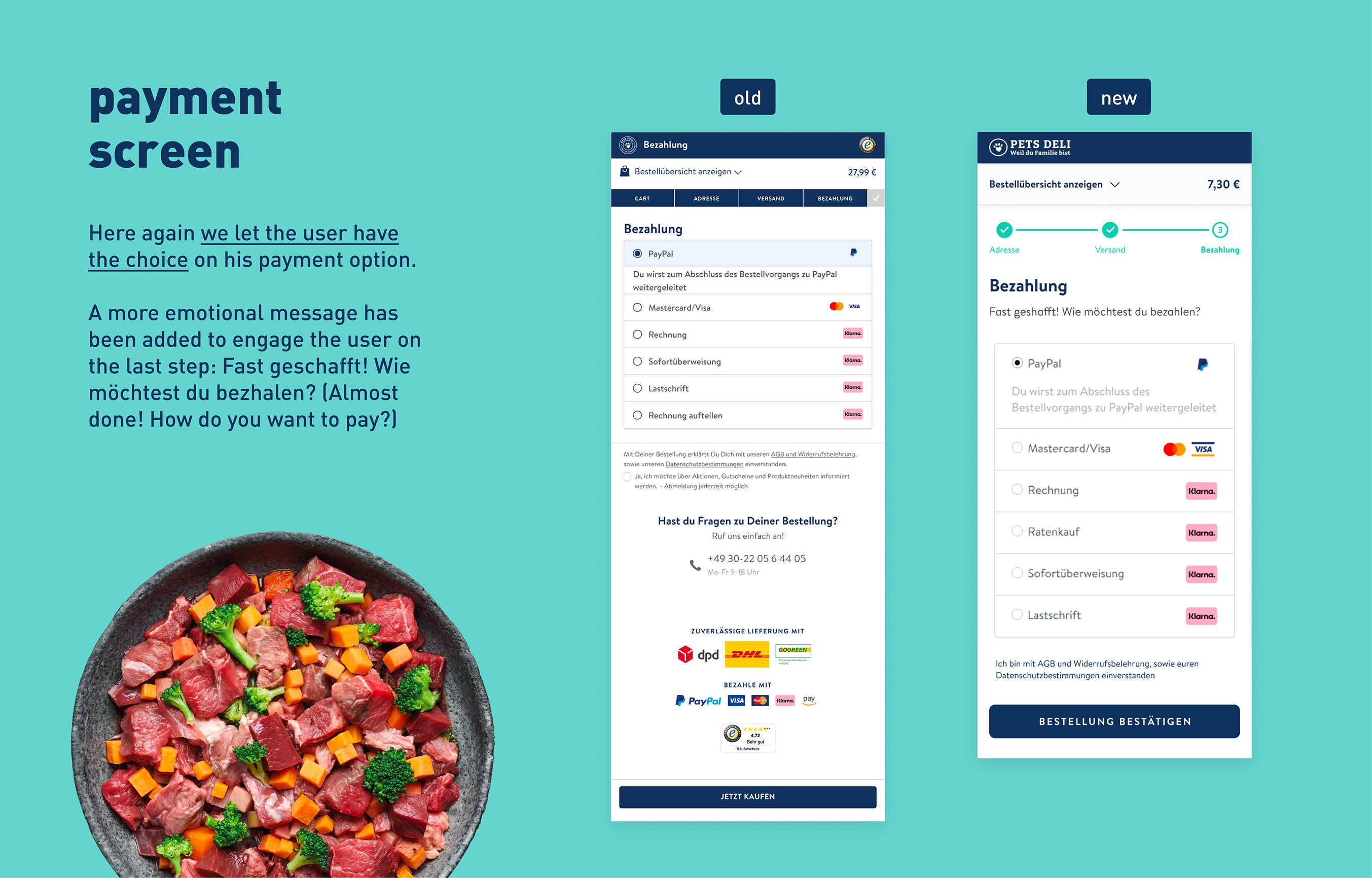
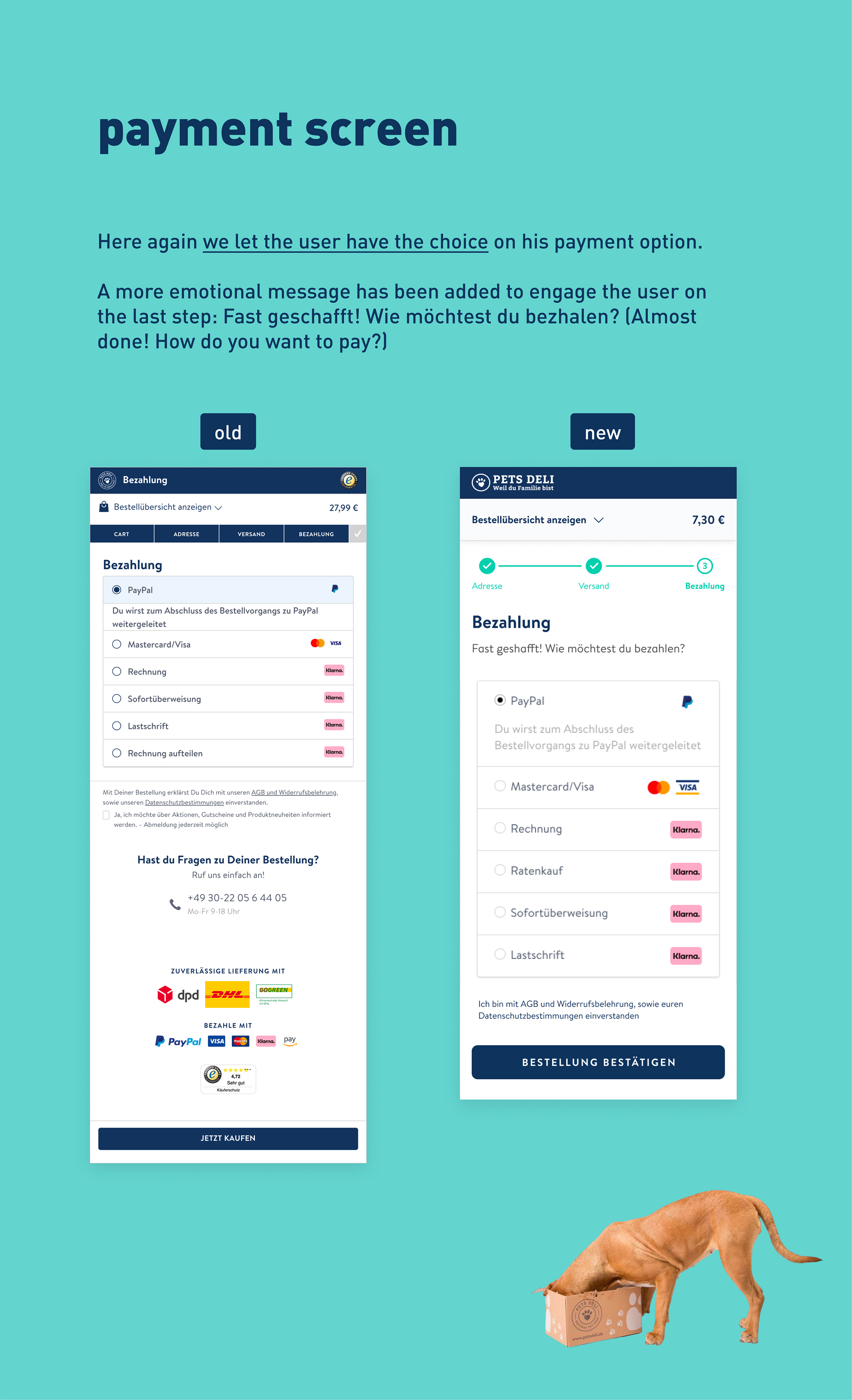
- payment
With the project manager specialized acquisition, we noticed a high rate of rebound during the checkout process. Of course we are sure of nothing. Why people are leaving the website during the checkout process? One of our assumption was to work on the redesign these screens in order to make the experience easier for the users.
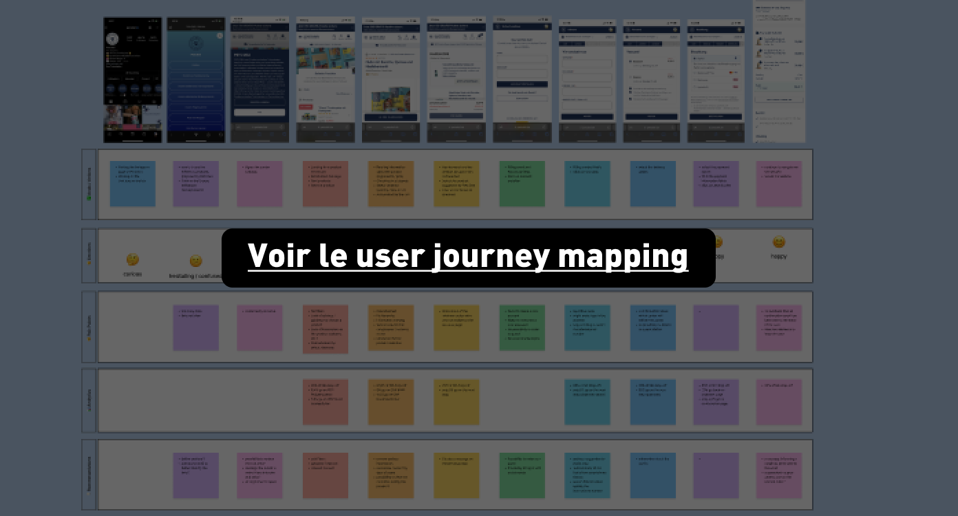
So we started with user journey mapping, which we have updated. This shows us the different stages in a user's journey. This is a user-centric process.
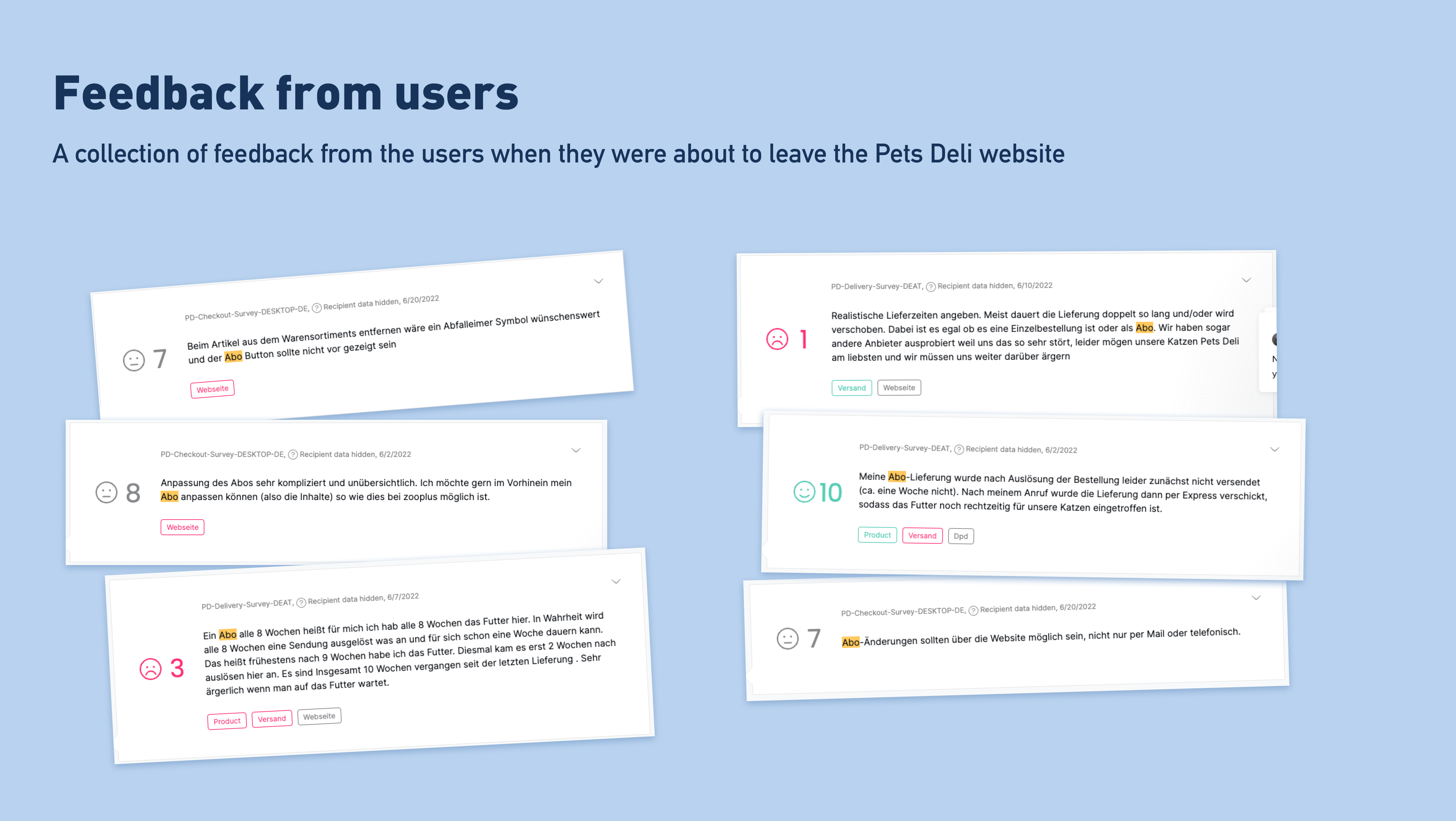
We collected a lot of information from user feedback. For example, a survey was available when users left the Pets Deli site. We have compiled some of this feedback in the pain points section.
Among other things, we have highlighted:
- tâches répétitives
- long scrolling
- no option to order as a guest
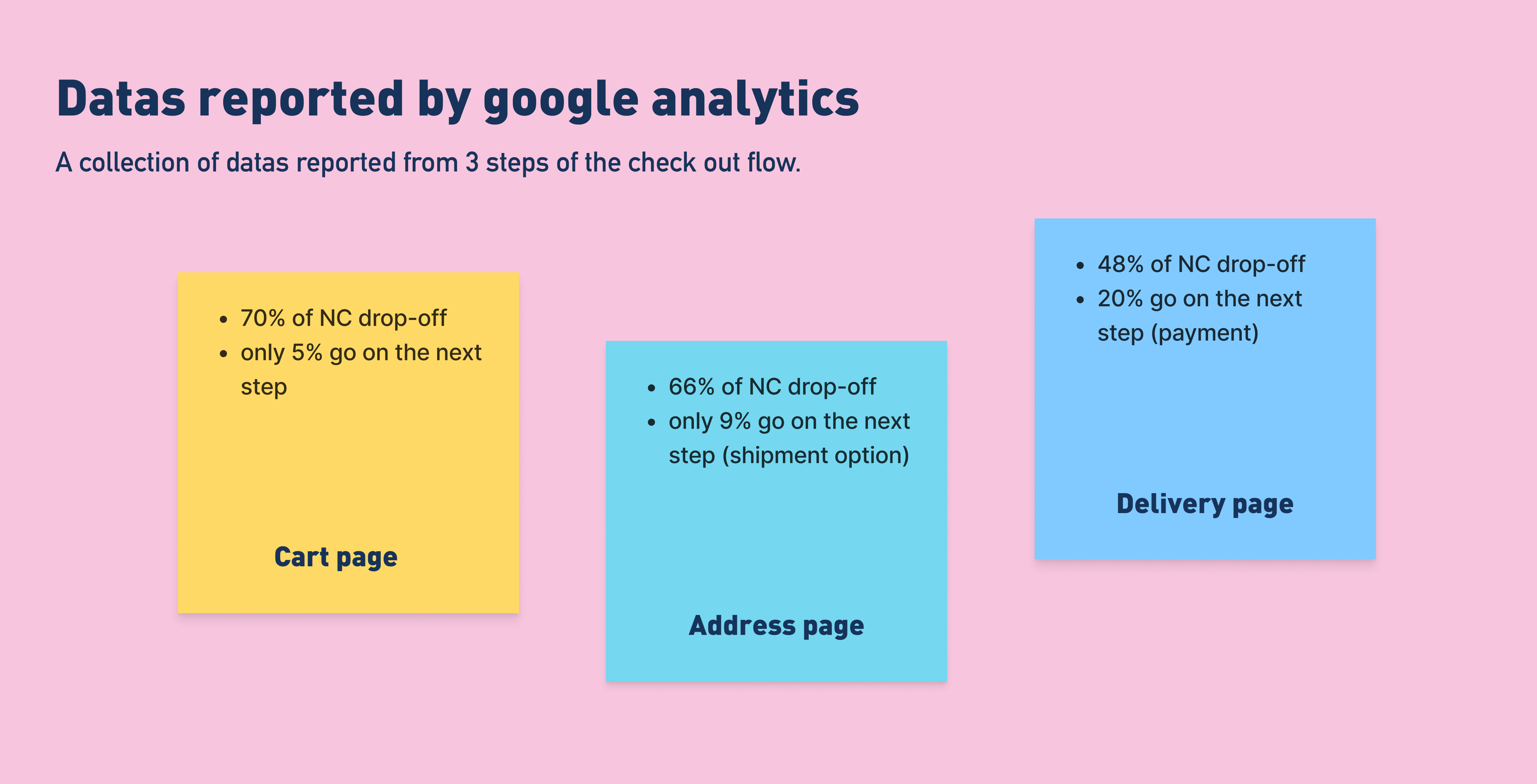
In addition to user feedback, we also analysed the data from Google Analytics, and observed a high drop-off rate (leaving the site) on several pages.
At Pets Deli, 80% of our users come from mobile. This is not to be overlooked, that's why we are mainly mobile first on the different projects.
Thanks to the Hotjar software, which allows to generate heatmaps according to the cursor activity area and the scroll zone, we can see for example on the shopping cart page, that no element is clicked below the CTA. It is therefore a matter of purifying as much as possible the unusable elements (newsletter registration, contact, social networks, FAQ): these are elements that are already displayed upstream on the site and which have no place at this stage. It is not essential to have it start the checkout.
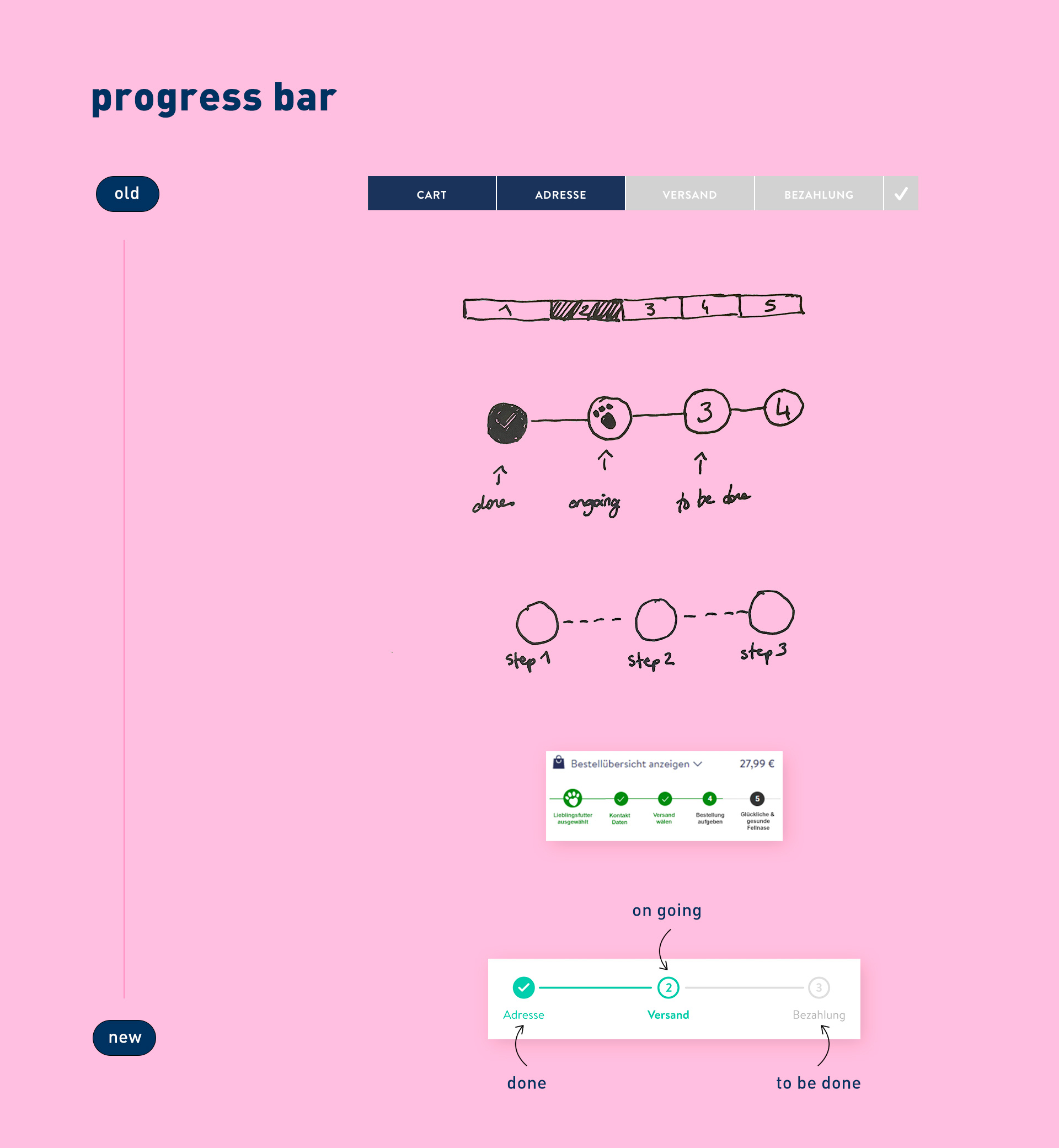
On the checkout steps we have left the option to display the order (Bestellübersicht anzeigen), because users click on it. On the other hand we have removed the cart icon, as the wording is quite clear; this allows not to overload the page during this crucial step.
Next steps
We had two weeks to work on this project with the different stakeholders. As mentionned before, we work as a prioriy on mobile: 80% of the users come from a mobile. First, our next step is to observe the behaviour of our users and the different KPI. We also have to work on the desktop version in order to keep consistency between the mobile and desktop website.
We also plan to work on the redesign of the confirmation page (give him accurate information about his order he just placed).