Colette
For this project during my UX/UI bootcamp at Ironhack, the mission was to design a responsive platform for a magazine. One user persona has been assigned, and we had to design this platform for this specific user persona. The outcome was to be hi-hi wireframes and prototypes. Even though we apply the whole design thinking process for this project, we focus more on the UI part.
Problem statement
After conducting a survey and several interviews, we have started to gather all the insights and analyze them. It appears that people can be inspired from many sources. Then, how to sort and simplify that? We came to the following problem statement: How to bring people together within the same identity, who feel continuously inspired by new trends?
User Persona & Audience
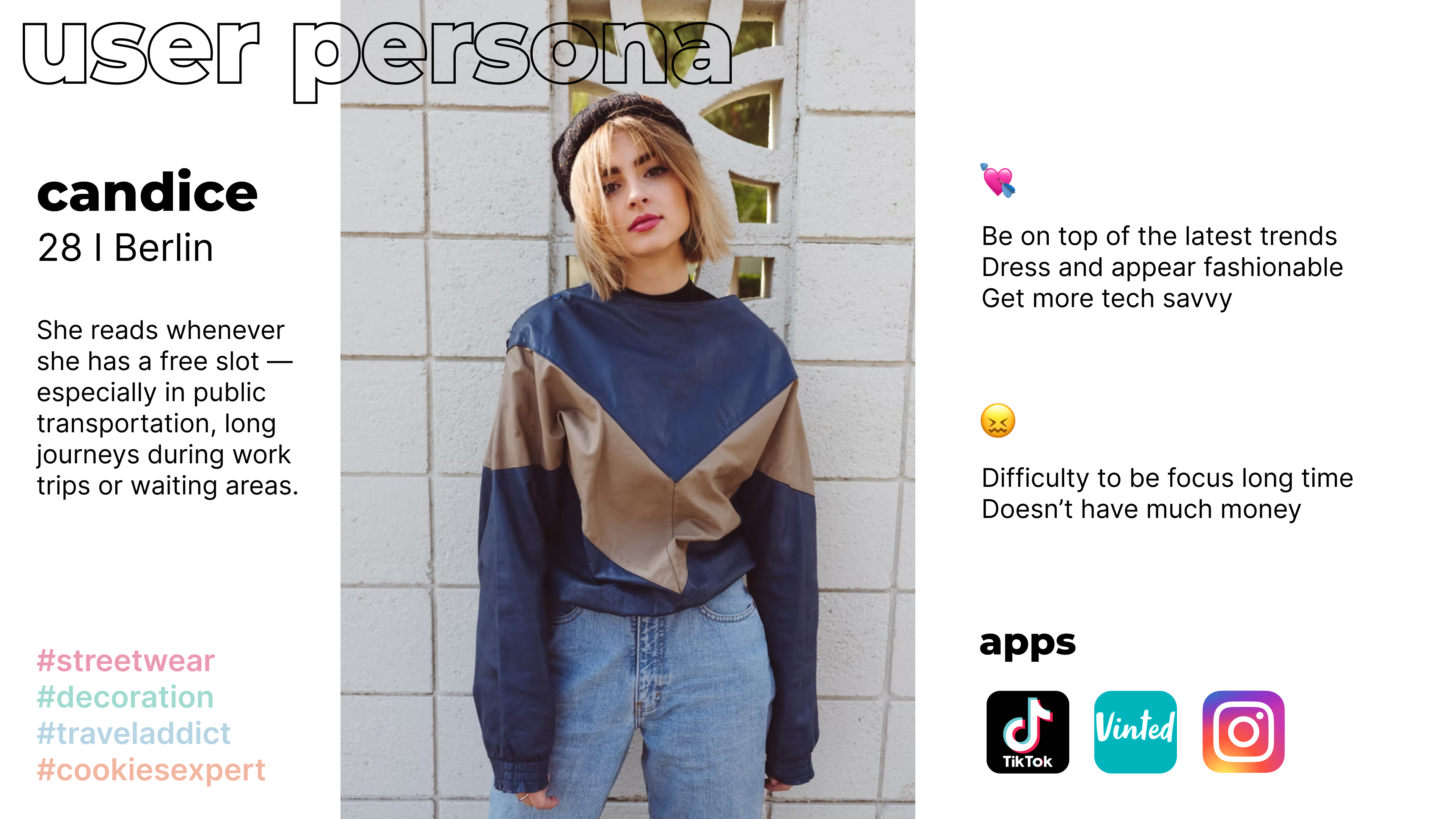
Here is above the user persona we had to work it. Candice is qualified as the trendy marketeer. She always feels inspired by the latest trends and uses publications as a source of inspiration for work.
Roles and responsibility
The group consisted of two students randomly assembled by the teachers. My partner Ildiko was not physically present in Berlin, thus we work remotely for the whole project. In this project, Ildiko took the UX part, and I took the UI one.
Scope & Constraints
As for the three first projects, the time frame was tight: 5 days. During the week, we kept studying with lectures about UI. Unlike the previous project, there was no external stakeholder. We had to design everything from scratch. We were completely free regarding the design: it was our mission to deliver a consistent, branded, and engaging experience and all the documentation that would allow the project to continue after your intervention as UI Designers.
Process
Empathize
We have started this project with Empathize method. We analyzed the user persona of Candice, trying to understand her goal and her pain points. We have conducted a survey and several interviews. It appears today that our users read fewer paper magazines. They read more online and the presence of social media shows that users are no longer only inspired by magazines or institutions, but between each others. The answers of the survey and our interviews allowed us to realize that users struggles to be on a top of the last trends. They can be flooded by many sources. How might we simplify this flow of inpiration?
Moodboard
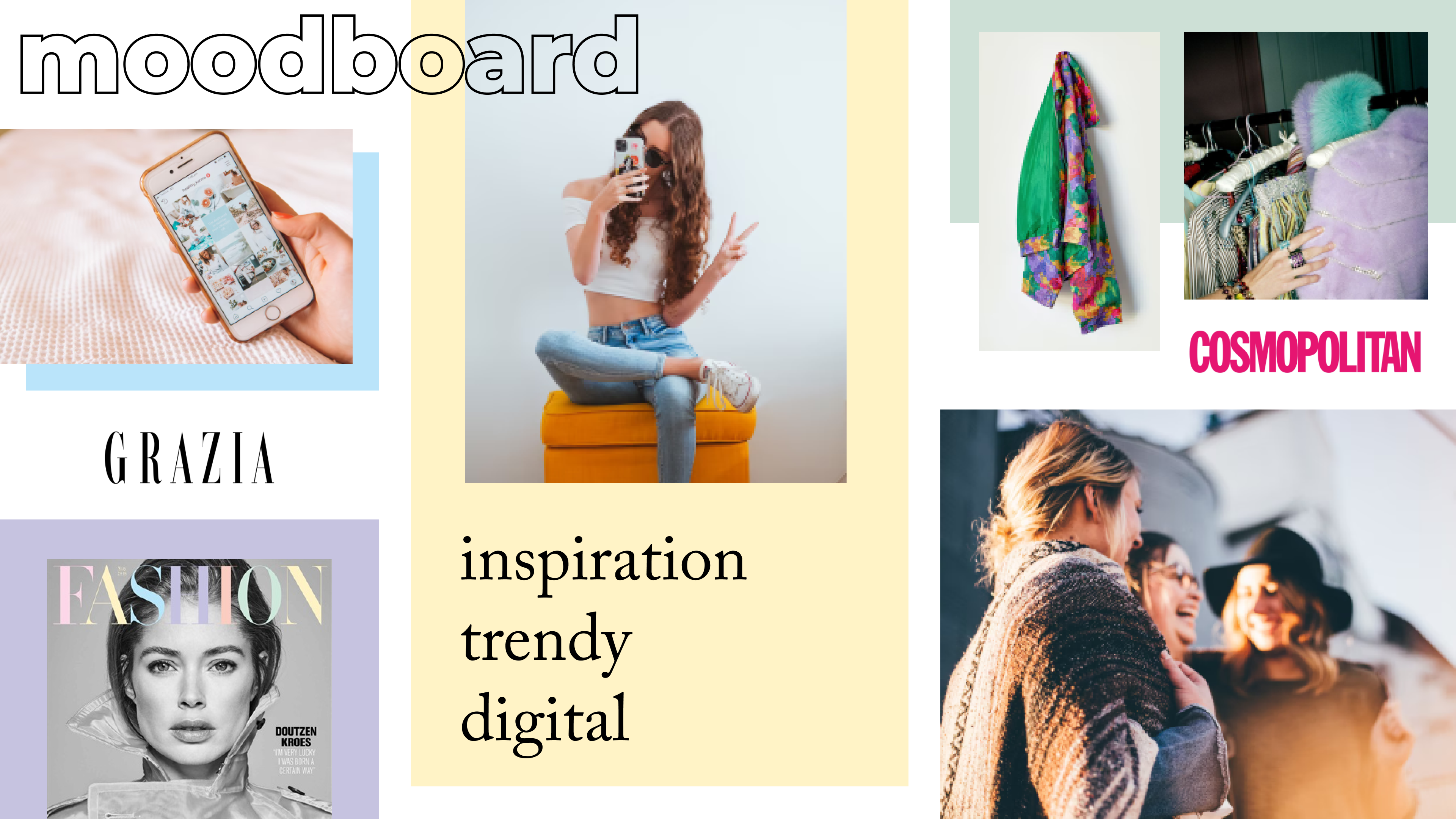
On the basis of the Candice’s user perona and the competitor analysis, we have created a moodboard. This helps us to inspire the design direction.
Content
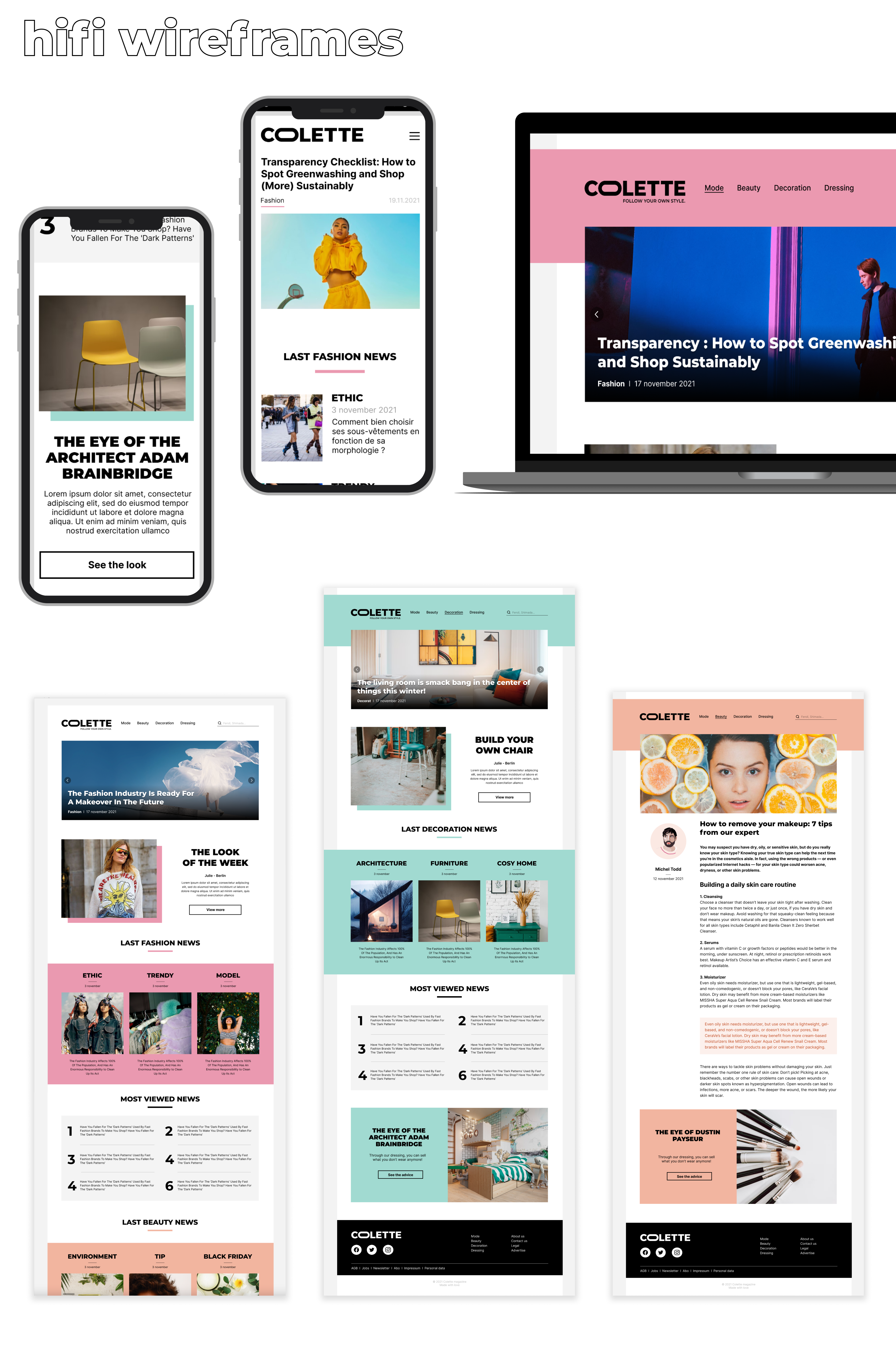
Then we have started to think about the content of the website. We wanted to clearly simplify the navigation. Based on our competitors analysis, we have defined 4 main sections: Mode, Beauty, Decoration and Dressing.
Mode, Beauty and Decoration will be a flow of content related to this topic. In these section we can find news, more in-depth articles from experts, but also specified section in order to link the reader between each others.
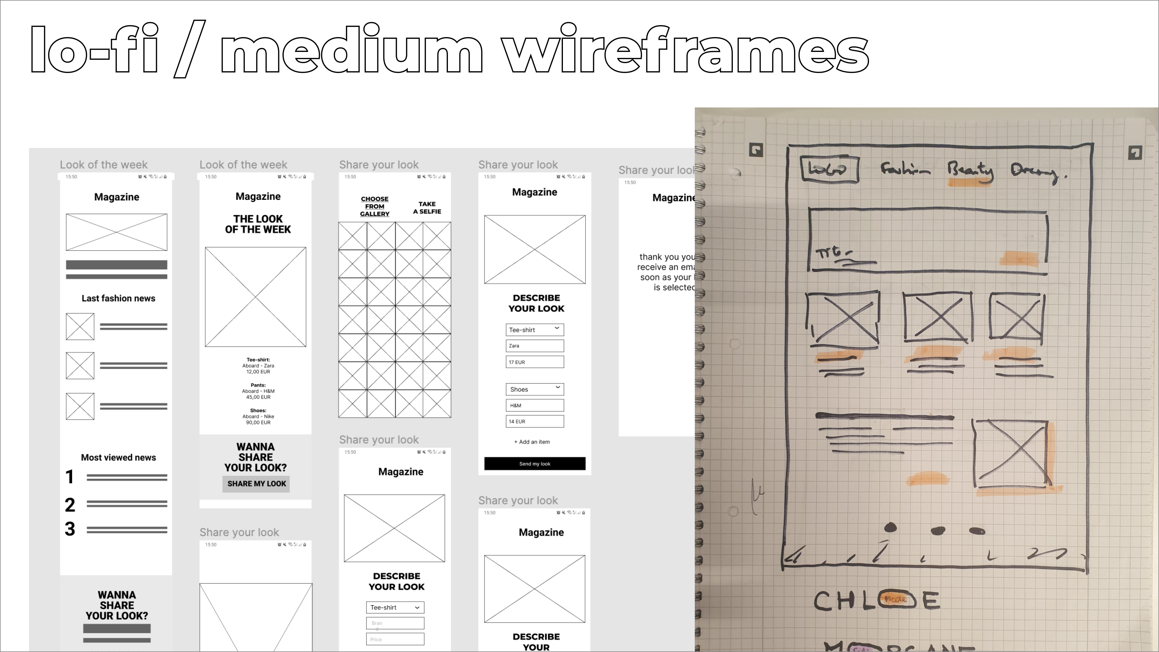
In the Mode section, we find The look of the week. This featuresallow the reader to apply to be The look of the week. They can apply every week, sending pictures of themselves and describing their look. Being selected, their look will be promoted on this section, and they will be able to inspire others.
Identity
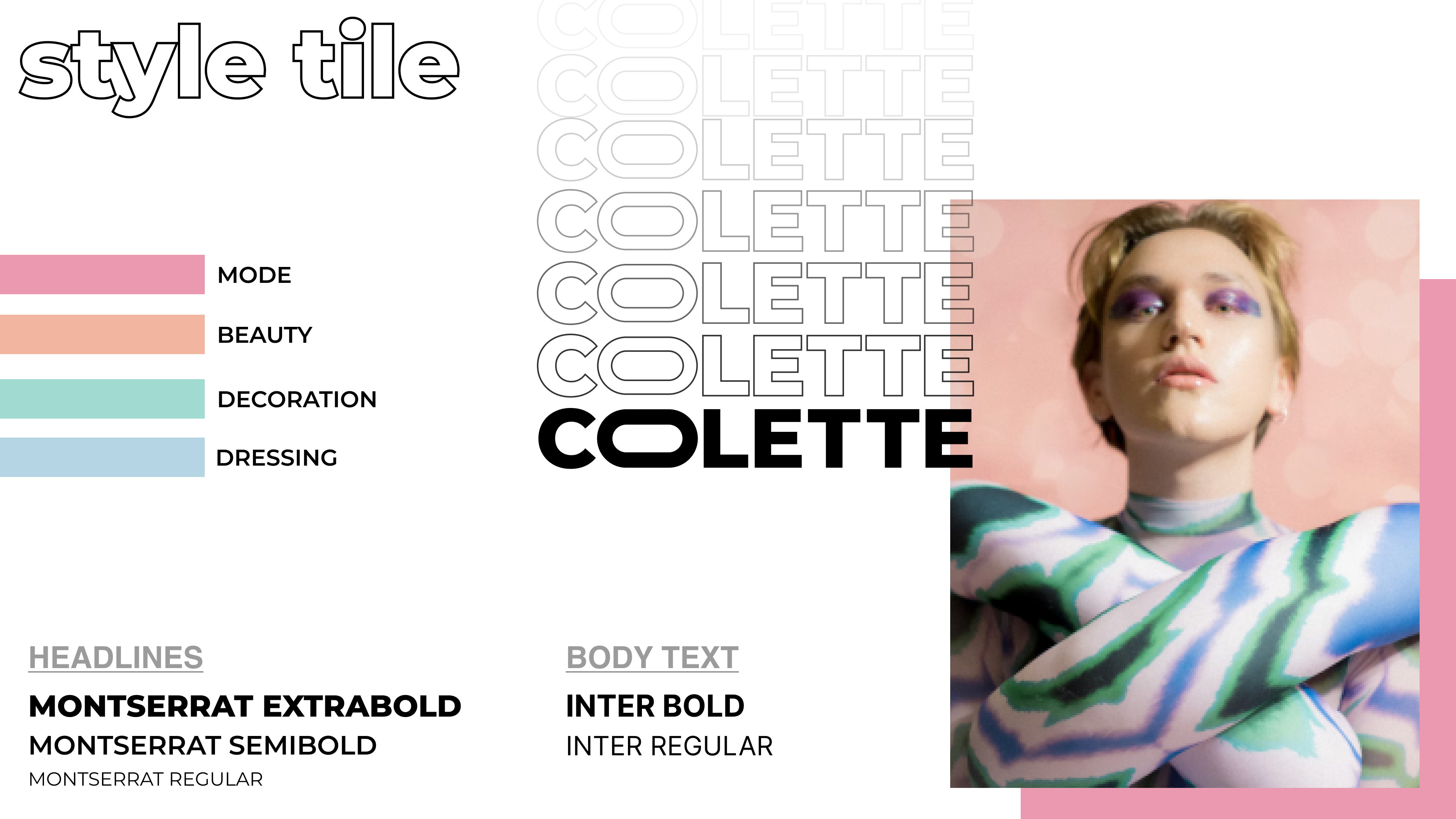
Through the brand of the magazine, we wanted to reinforce the feeling of close between the reader and the magazine. We had the idea to choose a first name, as if the reader could identify the magazine as someone close, a friend. Morgane? Cloe? Colette? We tried different names and we stayed on the choice of the name.
Four colours were defined to identify every section. These colours, slightly pastel, could be inspire from a make up palette.
Wireframes
The lofi and medium wireframes helped us to define the layout of the main homepage and the homepage of the others main sections. These homepage should be consistent in the layout, one element is changing: the color.
