Calendula
For this project, the mission was to design an application for a wellness institute during my UX/UI bootcamp at Ironhack.
This project is about executing a full UX/UI design process while applying fundamentals UX skills. By the end of the two weeks, I will be presenting hi-fi prototypes, testing results and next steps.
The National Wellness Institute wants designers to reimagine how people can adopt and maintain a routine that enhances their well-being.
The tool can be focused in any category related to personal wellbeings, such as (but not limited to):
- exercise and fitness, eating/diet, meditation, time management, etc.
- The only requirement is that it tracks the user's progress and pushes them to commit to a healthier lifestyle.
- The UI should reflect a fresh, updated image.
On my side, I have decided to work on the symptoms of premenstruel syndrom.
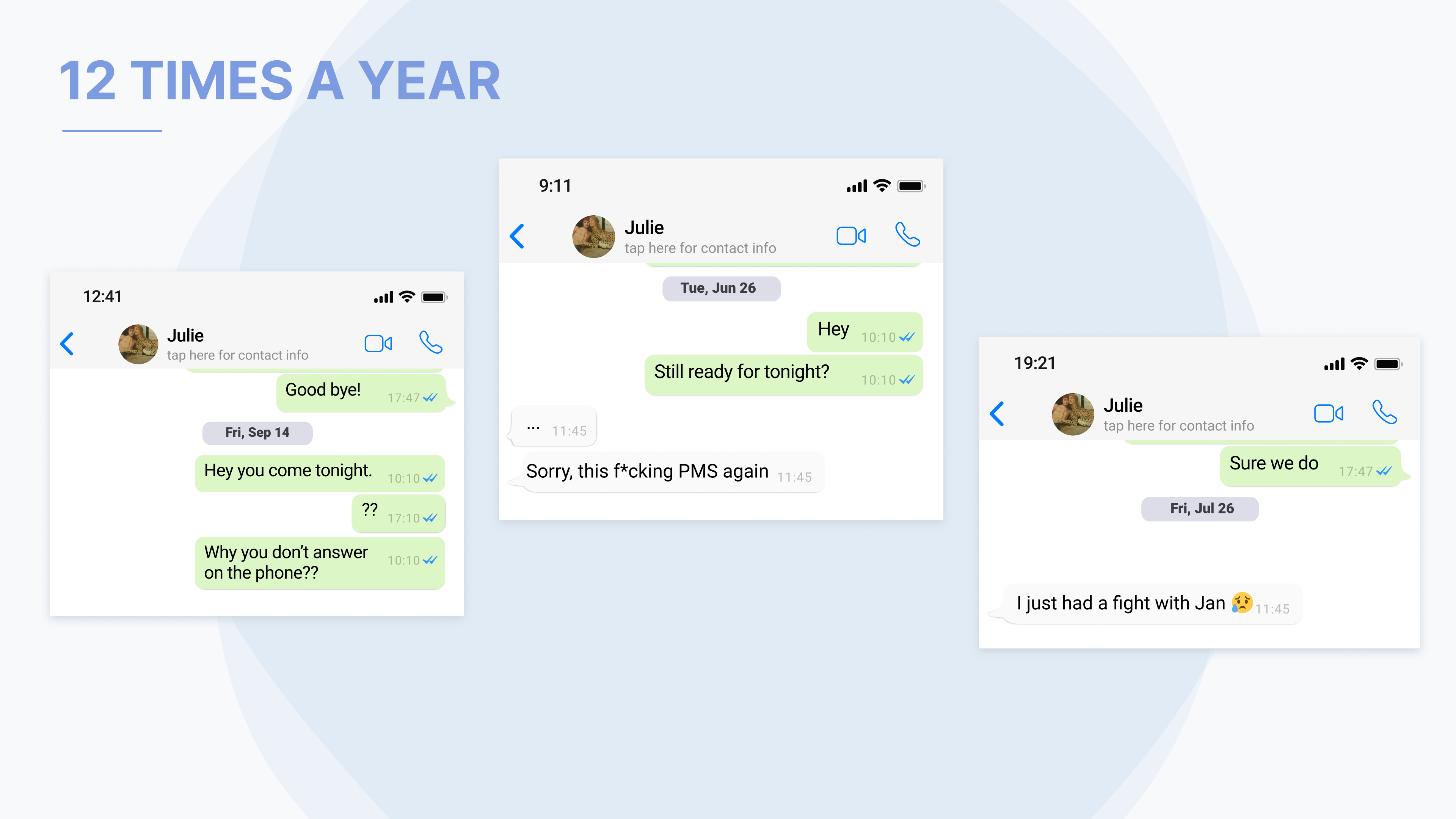
Here is below Whatsapp messages between my best friend and me. I receive this at least once a month this kind of message, where Julie is different from usual.
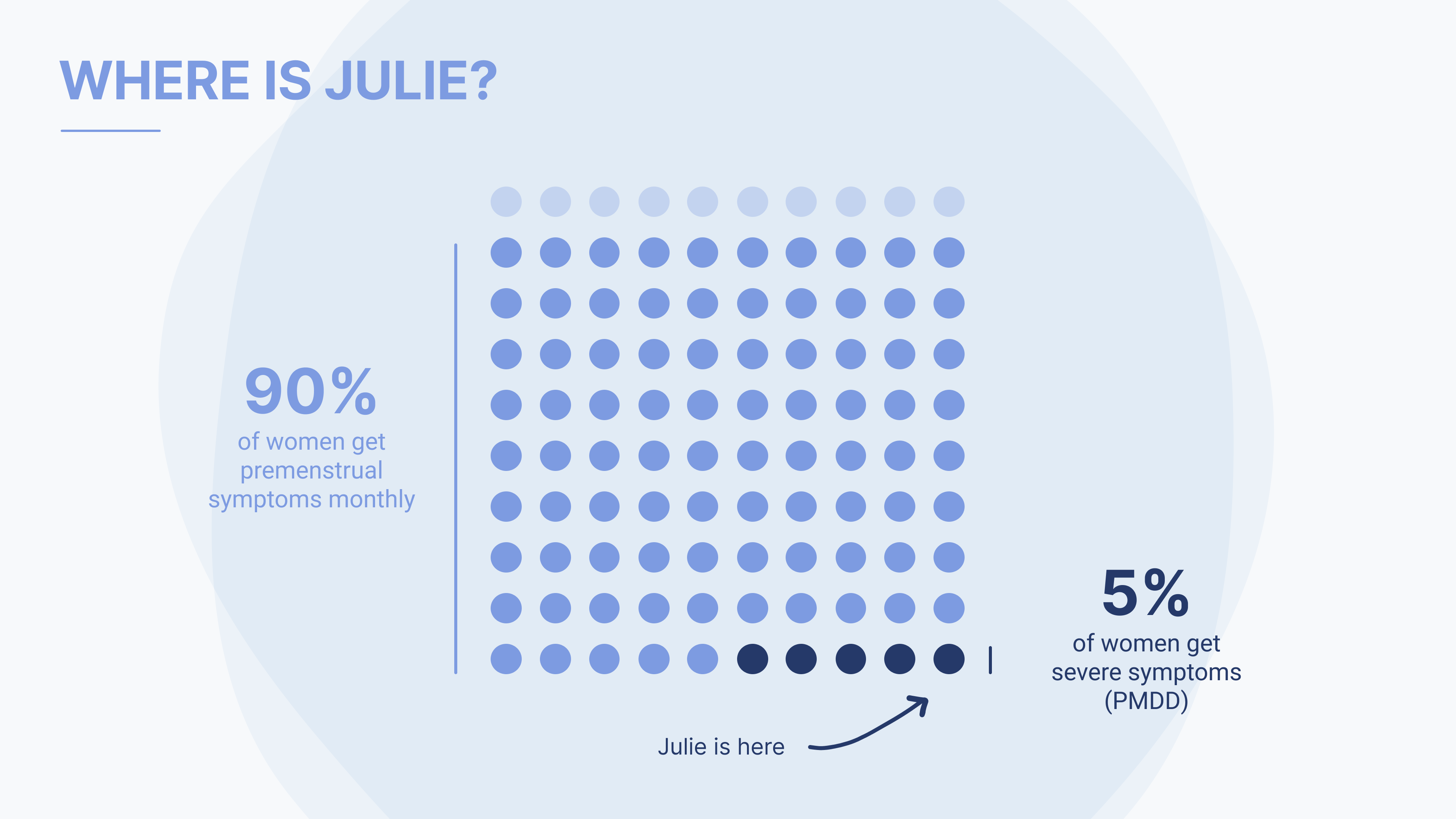
Why? She is a girl, and like 90% of women, she has premenstrual symptoms every month. And among these 90% of women, there are 5% who experience the most severe symptoms, which can lead to a more serious PMS: the Premenstrual dysphoric disorder (PMDD).
Problem statement
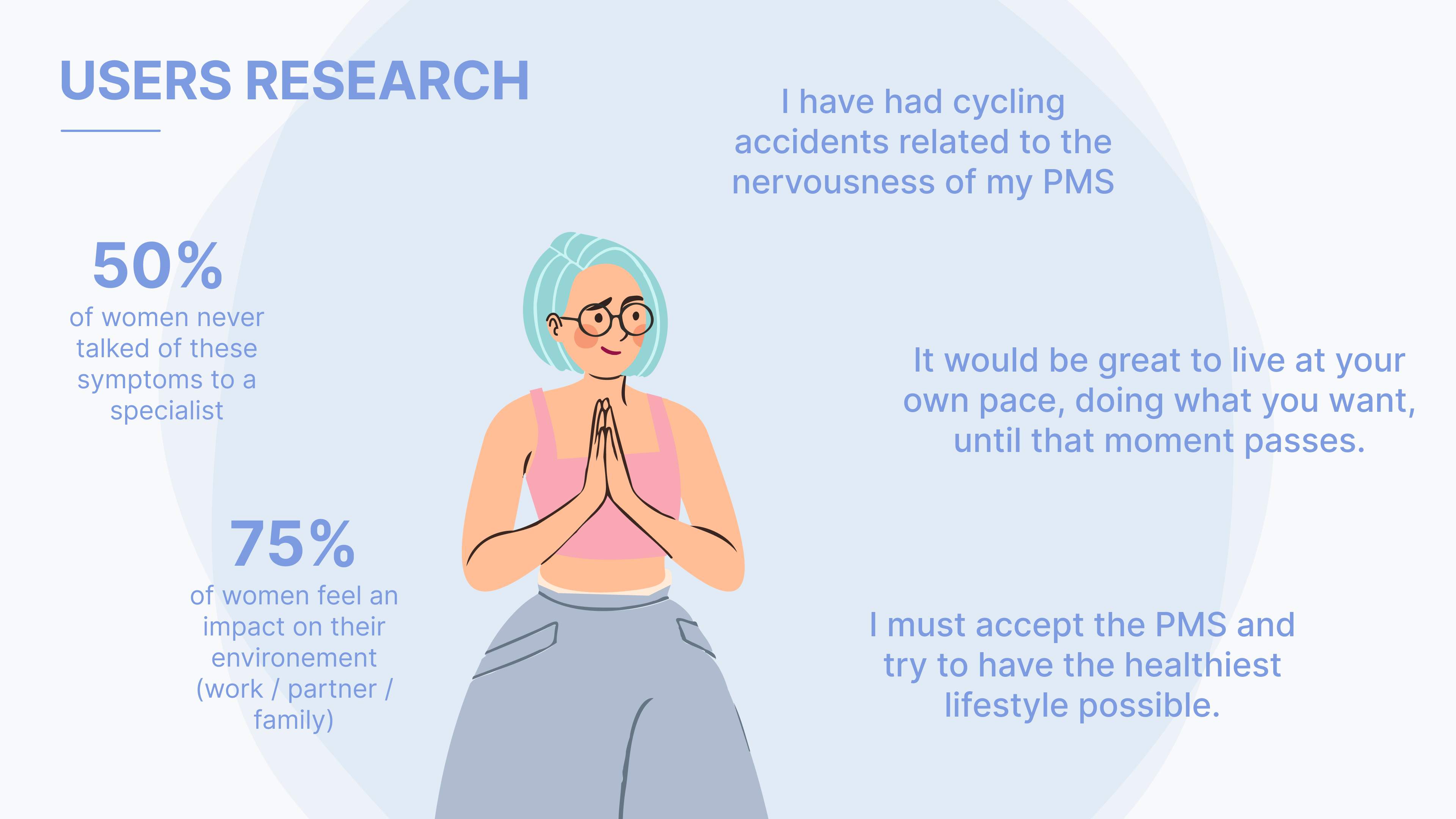
After conducting a survey and several interviews, I have started to gather all the insights and analyze them. It appears that 90% of women face premenstrual syndromes every month. And almost 80% of them feel an impact on their environment (work/friends/family). Then, how might we help them to anticipate their symptoms and identify their PMS?
I came to the following problem statement: Women who experience PMS symptoms need to identify and mitigate them as these symptoms negatively impact their daily lives and those around them.
User Persona & Audience
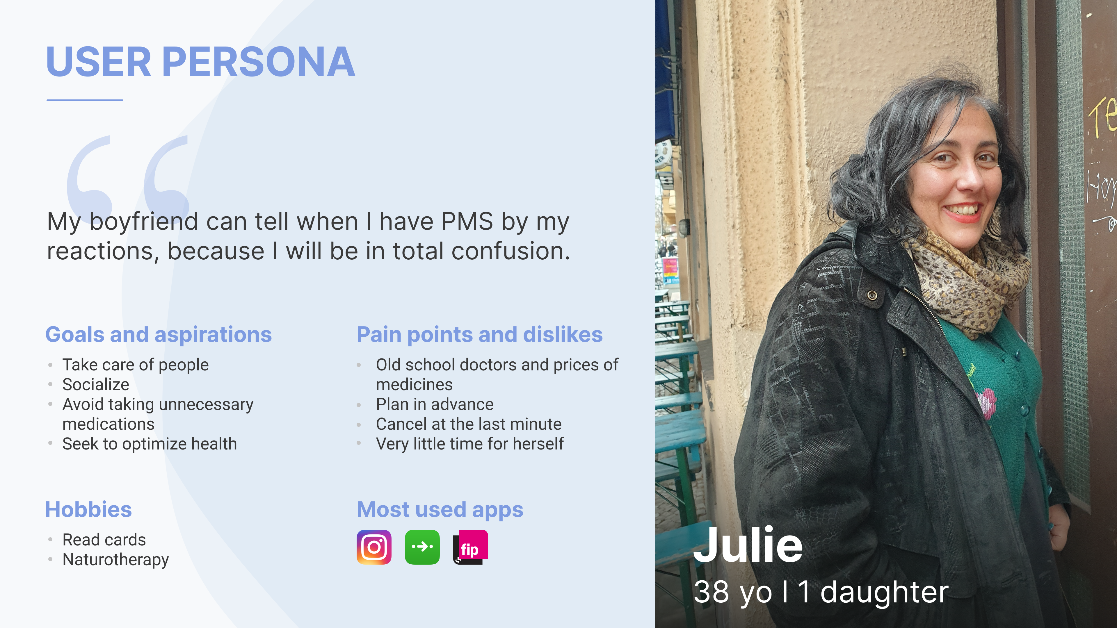
Here is above the primary user persona I worked with. Julie is a young mother, she works as a social worker and is very sociable. Always ready to meet new people, she is nevertheless slowed down several days a month because of these symptoms. These make her unstable, even irritable. She realizes that she can cancel at the last minute what she had planned for a while.
Process
Empathize
As mentioned above, it was therefore important for me to go and meet the users. Although only indirectly impacted by the symptoms of PMS, it is obvious that my main user here are women. After conducting a survey and several interviews, here is what came out.
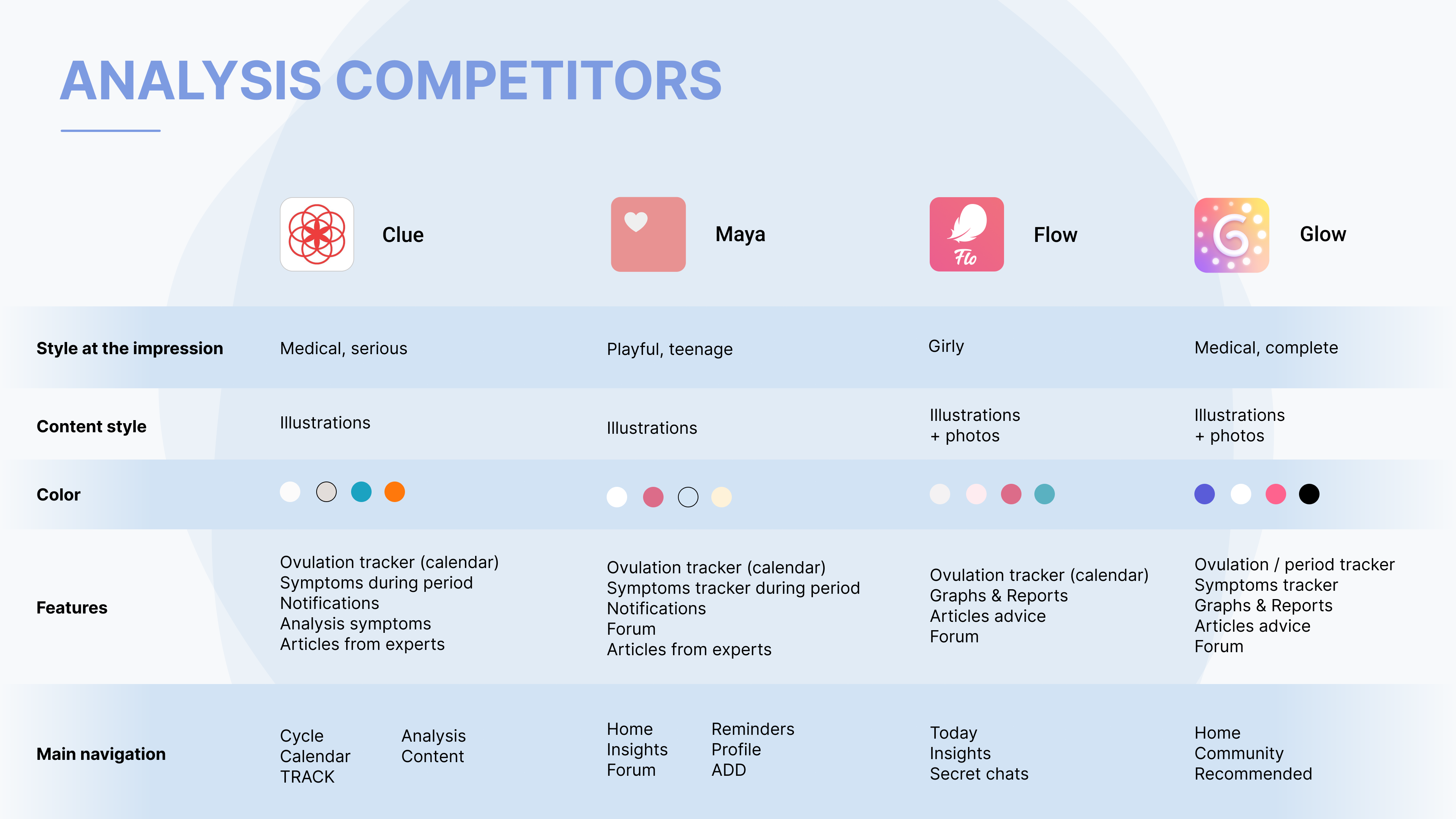
Analysis competitors
After a quick survey of my friends, here are some new apps on my phone: Clue, Maya, Glow, and Flow. All these apps stand out with one thing in common: their predominant color. Bathed in pink and pastel colors, they seem to confirm that old postulate: pink is for girls. Is it more reassuring?
These applications are very complete and present a multitude of features. The main one is the one that allows you to follow your monthly cycle and to know the period of fertility. The possibility to declare your symptoms is often proposed but quickly slowed down by the paying subscription.
MoSCoW
Here the MOSCOW method allowed me to determine the priorities and to make choices. What was the priority of this application? By rereading what came out of the interviews and surveys, the priority was to help women who suffer from PMS symptoms to anticipate them and in the medium term to give them solutions to reduce the effects.
Here it is clear that the tracking of symptoms is an essential feature. Over time, the recurrence of certain symptoms can help identify the type of PMS. It is also important to have a calendar that allows the user to anticipate the symptoms.
For other features (virtual assistant, member subscription), it can be developed later, but let's keep in mind that we are delivering a Minimum Viable Product.
Moodboard
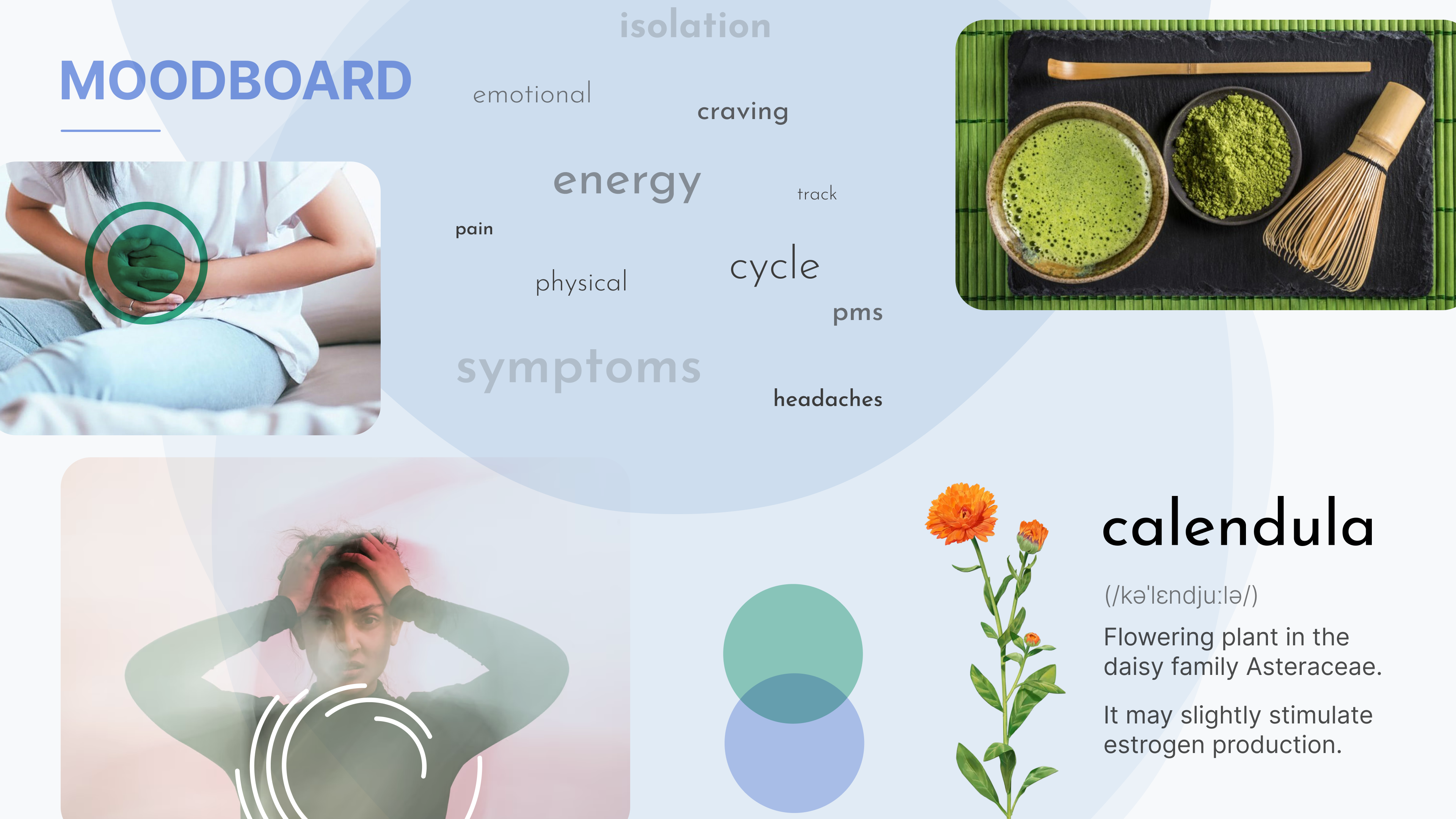
Creating a mood board, I wanted to do some research on the graphic universe. First of all, the name came up by chance. Calendula, this universal-sounding name, is a plant. But one of its properties is that it can slightly increase the production of estrogen. Bingo, so it will be Calendula.
Wireframes
I wanted to avoid pink, but it was difficult to get away from it. Several color trials (orange, pink, red) didn’t convince me and I had to turn to several users to have their point of view. The results were quite disparate. I continued with several tests and wanted to introduce the purple color which contrasts with the other colors. By re-questioning the users, it is this color that was solicited: it brings a certain calm, which is sought during this stressful period.
When you launch the application for the first time, an onboarding section asks you for some information to define the days in the month when the PMS will arrive. This will allow you to define a calendar on the home page that will allow you to anticipate.
During the PMS period, a central button appears above the main navigation. This button allows the user to declare his symptoms. In 3 steps, she informs what is her mood and what are his physical and psychic symptoms. According to his information, different solutions will be proposed to the user.
These solutions, only natural, will allow to reduce the symptoms.
The Analysis section of the main navigation will allow the user to follow the analysis curves of these different symptoms. He will be able to select them by dates or by types of symptoms.
Thanks to this history of symptoms, it will be possible to detect the type of PMS with specialists. This will enable the best remedies to be found to alleviate the symptoms.
