Tinta nos nervos
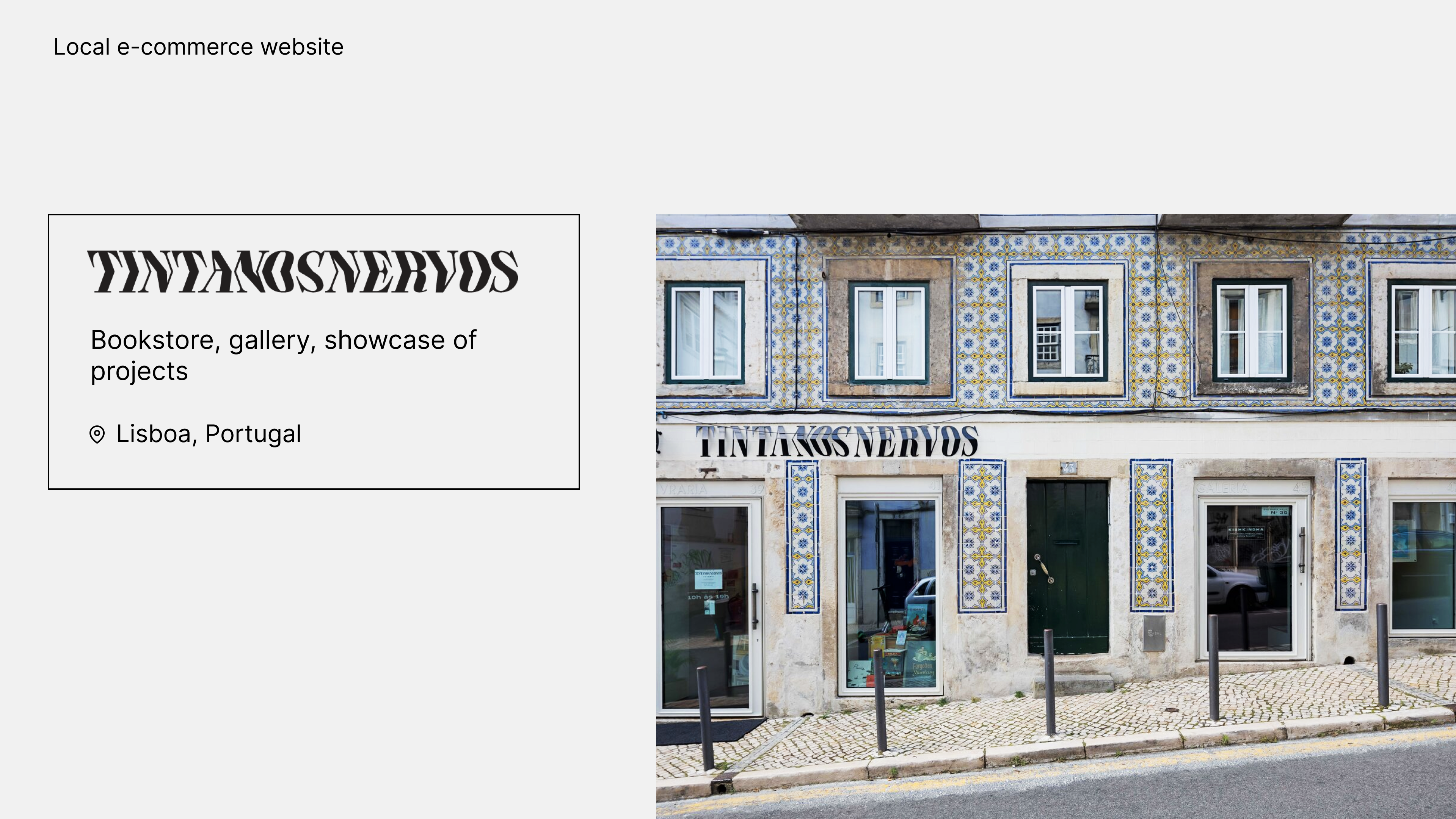
The mission was to find a local store/business and to convince it to work with us for a week. We have chosen to work for a bookstore located in Lisboa: Tinta nos Nervos.
Overview
For this project, I am joined by Lynn, Olanrewaju et Luís. Luís, a native of Portugal, already knew this bookstore there and fell in love with the place. The Tinta nos Nervos team is made up of people with a variety of backgrounds in several areas of specialization, including, artistic curatorship, criticism, academic research.
Our first reflex was to visit the website www.tintanosnervos.com, to know more about the business. I had a lot of thoughts when I visited the website:
- Woow beautiful drawing
- It seems there is a lot of content
- Too bad there are not selling online!
Lynn my classmate pointed out the opposite: they do sell online! Ah, true… then an interesting topic for the next steps.
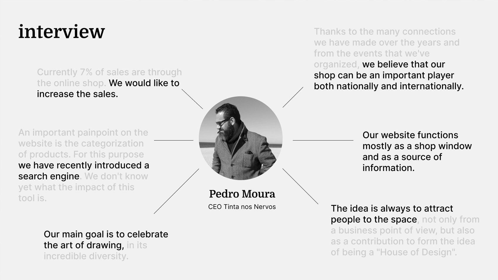
To start the project, we had to prepare our interview with the stakeholder: how did the project start? What are the goals/visions of the company? We needed to know more about it, because this time, in addition to the users, we are dealing with another stakeholder: the owner of the business.
Problem statement
Let’s come back to the website. We have asked some users to visit the website and he wrote down their impressions. Some of them didn’t notice there was an e-commerce section. That is one of the big pain points: how to become a reference at a national or international level without a clear digital strategy.
Tinta nos Nervos customers need a better-structured e-commerce website because they need to easily find and purchase products they want.
User Persona & Audience
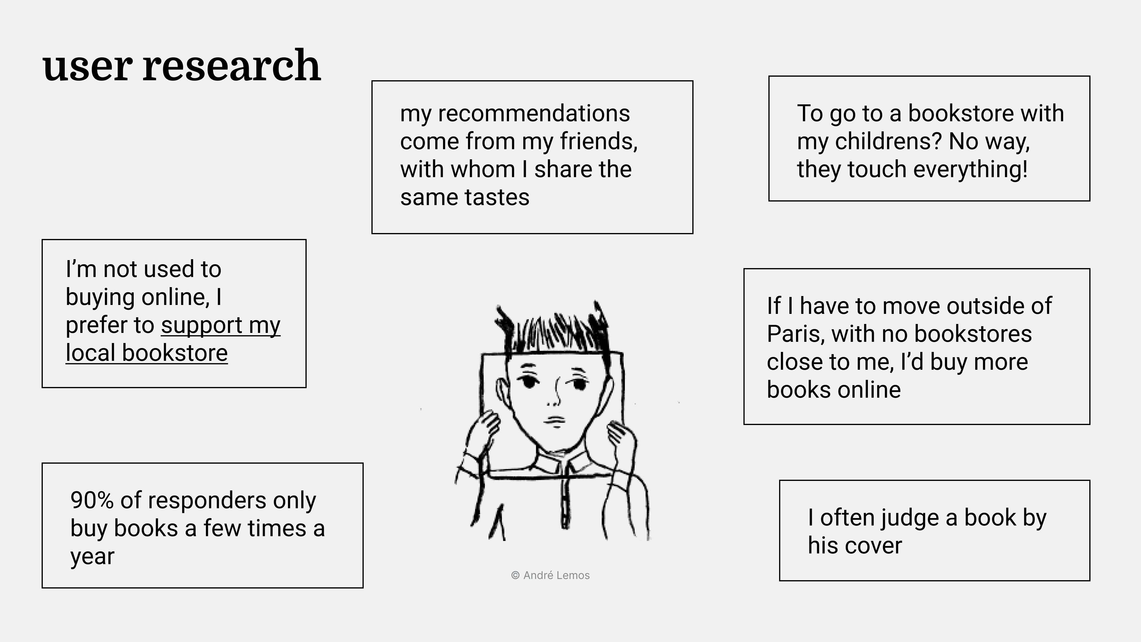
We had to go through the user research method to know more about our users. We have decided to conduct a survey and some interviews. Different insights came out, and some of them are recurrent: people want to support their local store. It was important for us to keep this link between the local business and the users.
Current website
One of our first mission was to contact the owner of the store. At the same time, we had conducted a survey to have more quantitative insights about users. We gather results together, and a user began to take shape.
Since the store has a website, we have decided to explore it, and we defined a site map. We realize quickly that the navigation was not clear, there was a lack of hierarchy, the content was not well structured. We simplified the main menu and reduced the number of categories.
Wireframes
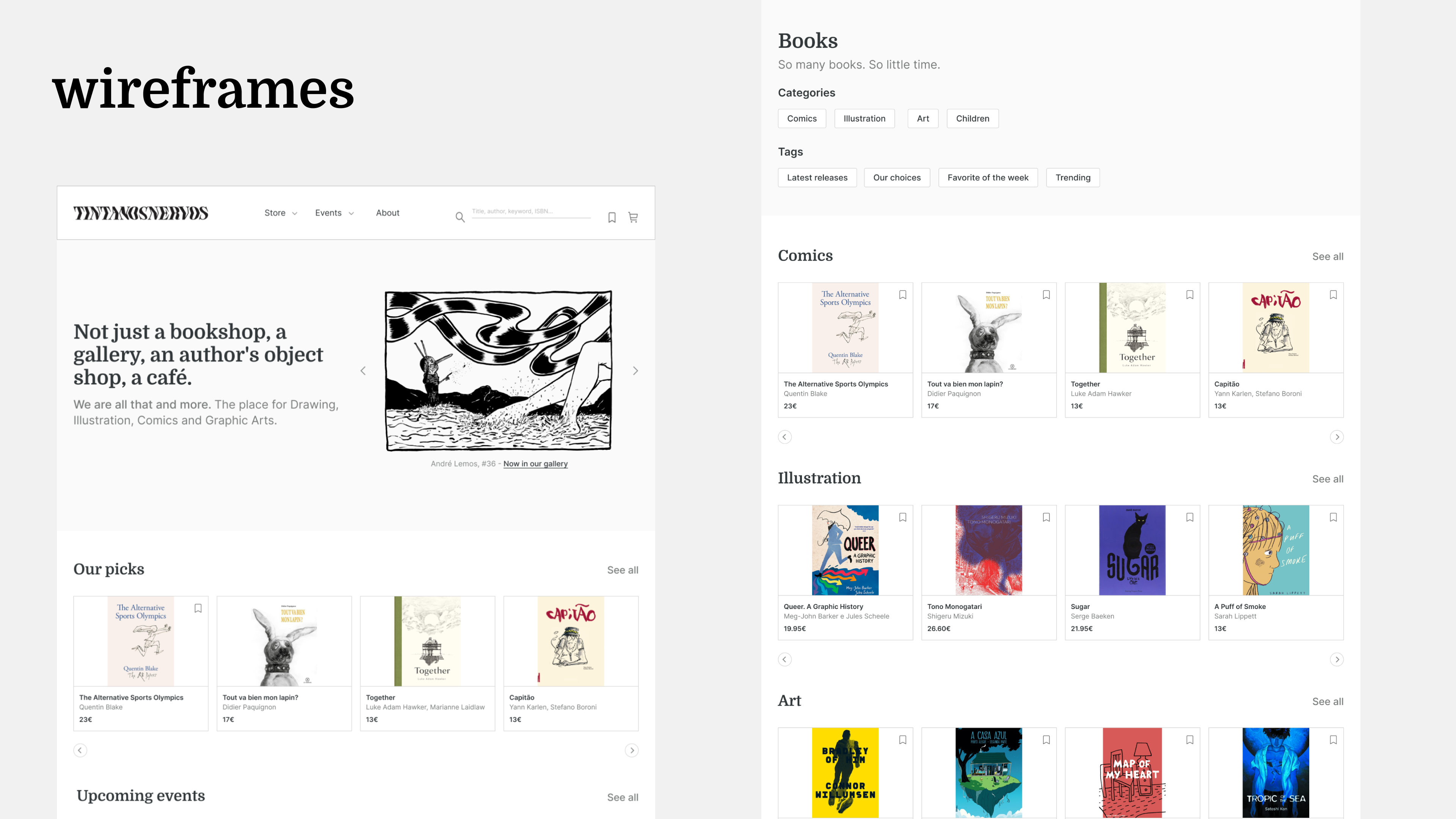
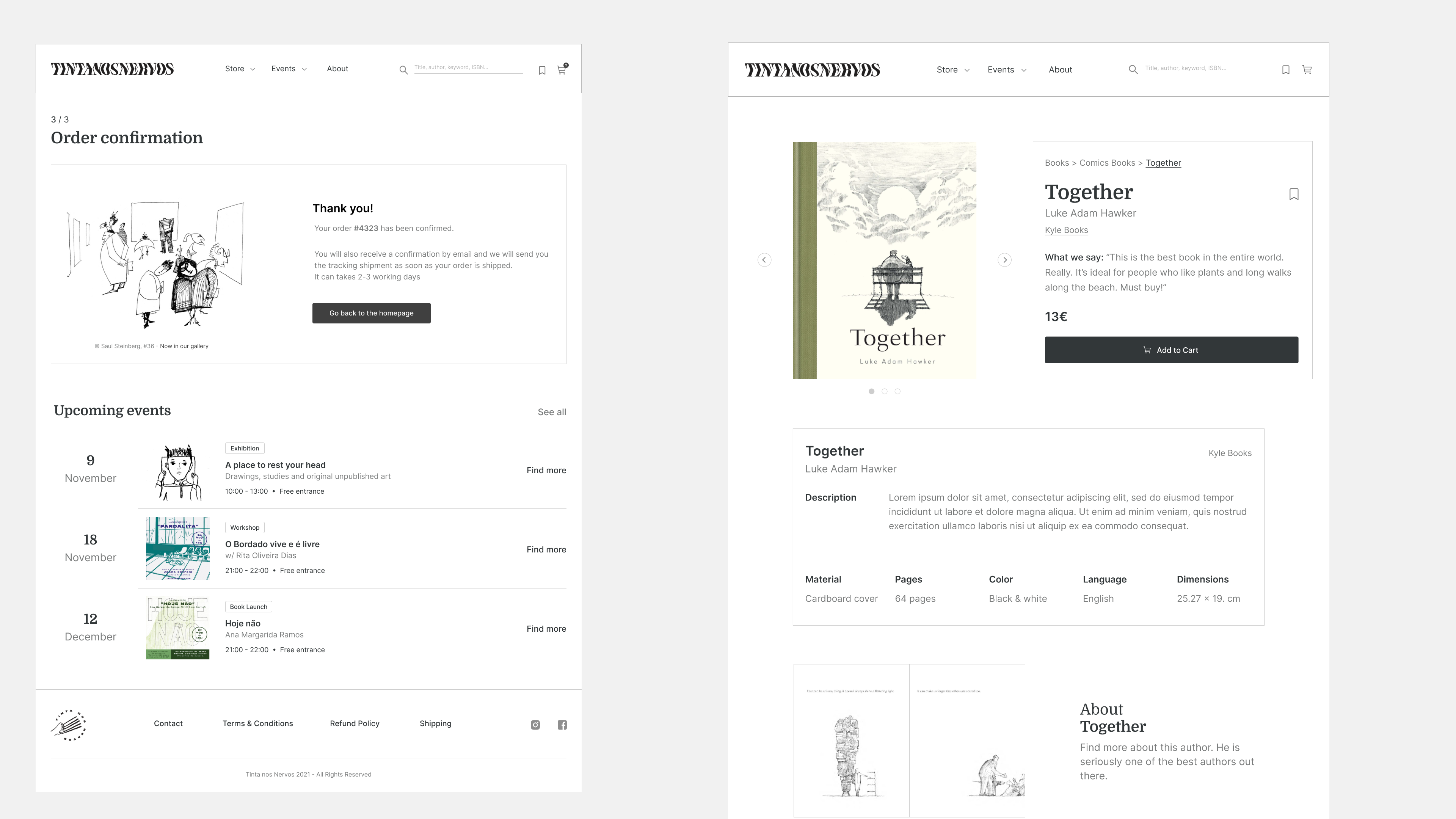
Once the categories are defined, we went quickly to the wireframing process. We all sketched some screens, relating to a specific path. To start we sketched the screens of the product page. It is one of the most important templates of the website, we wanted to have this page as a base. Our main goal was to simplify the layout and to make the book the central element of the website. As the covers of the book are colorful, we mainly used white and grey as palette colors.
